Introduction
TomTom Design System
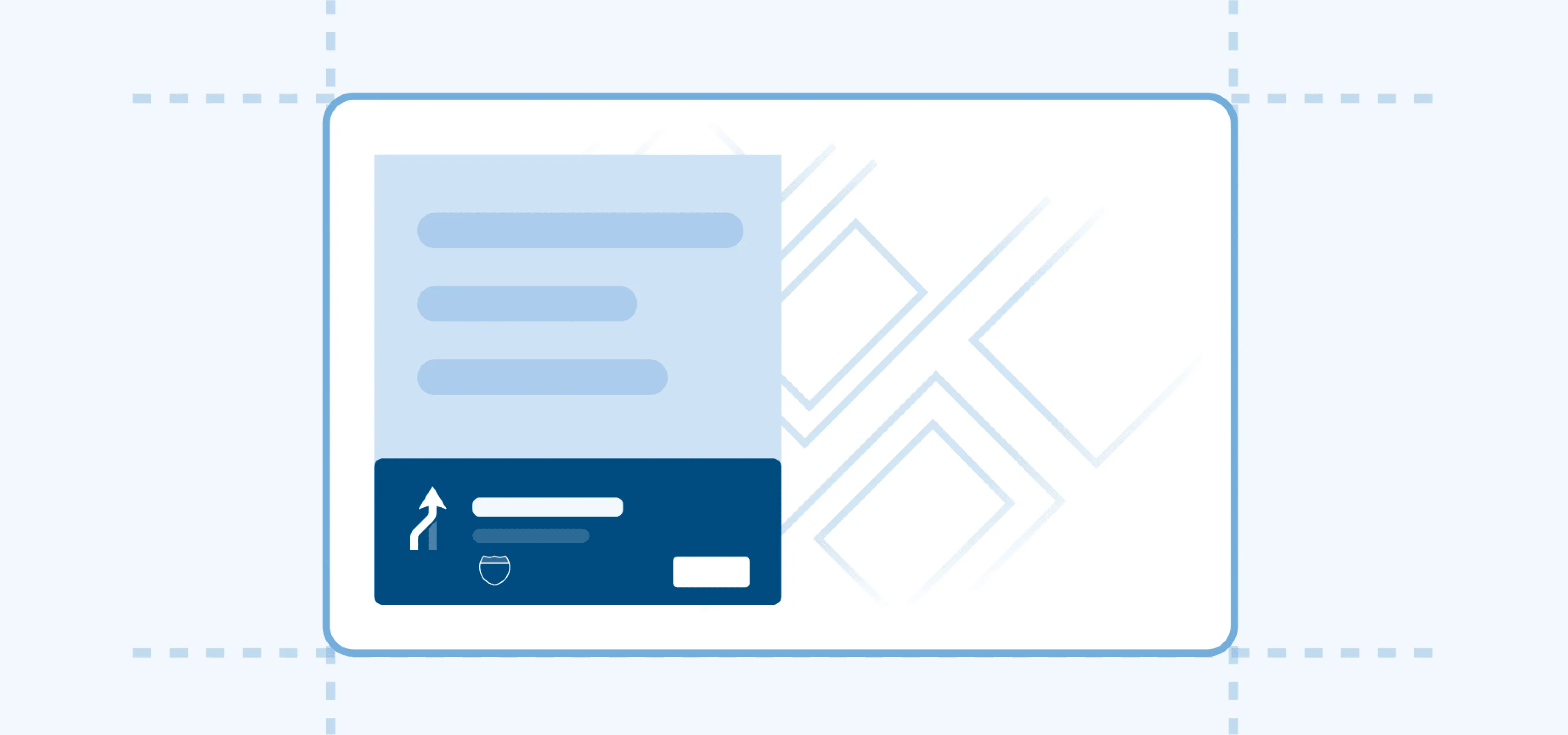
TomTom Design System is TomTom’s white-label design system built for navigation products.
It helps internal teams create consistent, efficient, and visually aligned experiences across all TomTom products. At the same time, it enables OEM partners to apply their own branding while preserving a unified approach to functionality and theming.
By providing a shared set of guidelines and components, TomTom Design System supports seamless collaboration between TomTom teams and external partners, ensuring scalable, high-quality outcomes.
Foundations
Foundations form the base of the design language and are essential for building a cohesive user interface.

Design tokens
Design tokens represent small, repeatable design elements such as colors and typography.

Colors
A color system that provides a hierarchy of information and ensures contrast standards.

Sizing
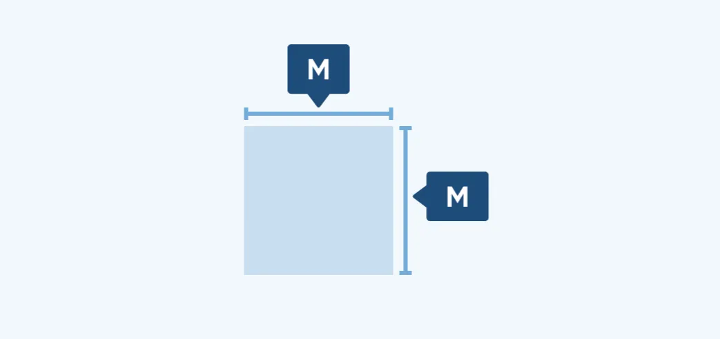
Sizing tokens define the physical dimensions of UI elements, so components stay readable and consistent across screen sizes.
Spacing
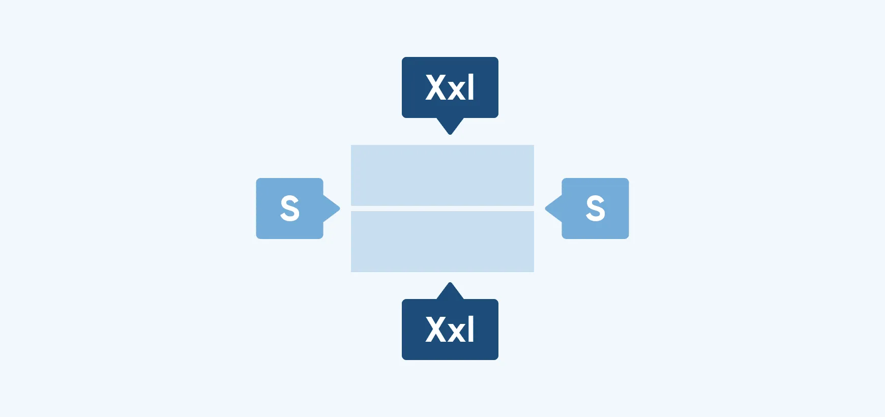
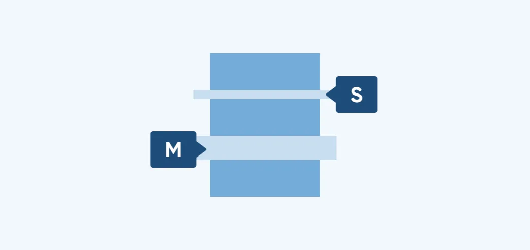
Spacing tokens define the distances between and within UI elements, for balanced and predictable layouts.

Component tokens
Component tokens define the visual properties of UI elements and show which properties you can customize.

Effects
Effect tokens define shadows and the opacity treatments used for disabled and loading states.
Recommended resources & guides
Read about our design guideline and adaptiveness framework to get familiar with our approach.