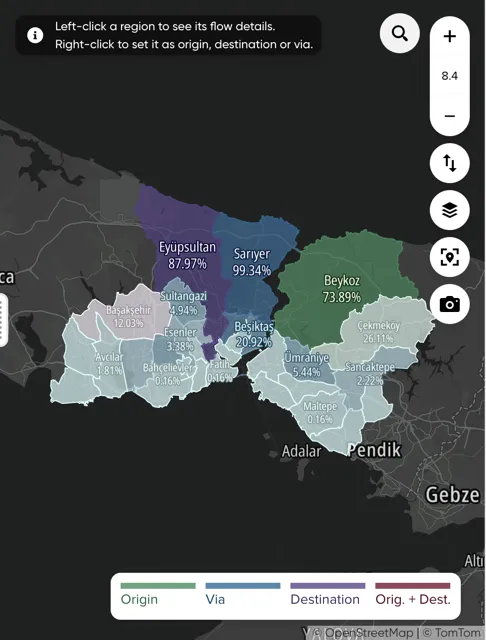
Flows explorer
The Flows Explorer visualization lets you pick any combination of regions as Origin, Destination or Via and explore the trips between them, together with their trip statistics.
See Viewing analysis results for common top bar actions, Date and Time controls, results panel placement, map controls, and legends.
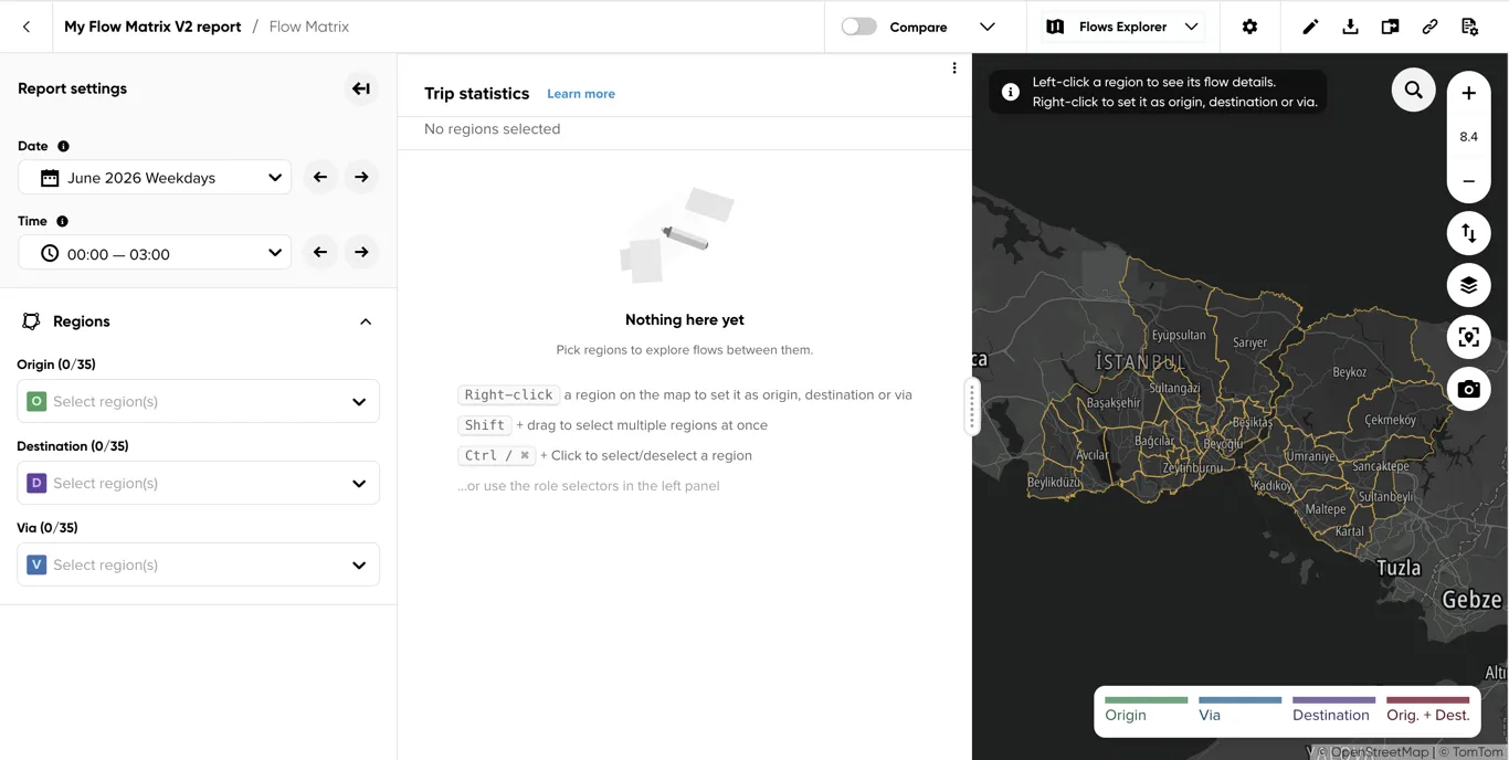
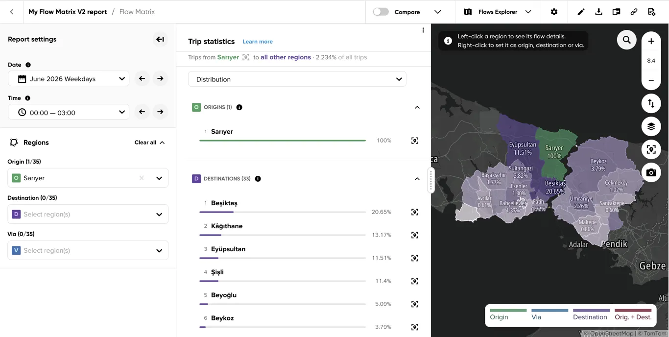
Once at least one region is selected, the Trip statistics panel shows the share of trips between the selected regions, and the map colors every other region by its share of those trips.
Top Bar - Info & Actions
Common report actions are described in Viewing analysis results. Flows Explorer adds the following visualization-specific actions.
Visualization type
Switches between Overview, Matrix and Flows Explorer — see Overview’s Visualization type.
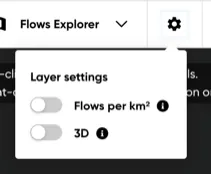
Layer settings
Opens a popover with two map-layer toggles:
- Flows per km² — normalizes flow values by the area they cover, so differently sized regions can be compared fairly. Disabled while a via region is set, since via flows aren’t normalized this way.
- 3D — extrudes each region’s surface in proportion to its value; right-click-drag the map to tilt the view and see the extrusion. Disabled until a region is selected.
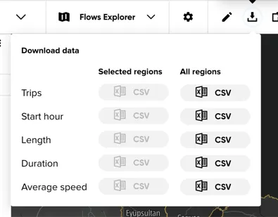
Download results
Downloads results as CSV, for Selected regions or All regions: Trips, and — when trip statistics are available for the report — Start hour, Length, Duration and Average speed histograms.
Left Panel - Report Settings
Date and Time
See Date and Time for the common selector mechanics, assignment rules, and information tooltips.
Regions
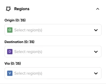
There are two ways to assign a region’s role:
- Use the Origin, Destination and Via selectors in this section.
- Interact directly with the map: right-click a region to set it as origin, destination or via, Shift + drag to select multiple regions at once, or Ctrl/Cmd + click to select or deselect a region.
Once any region is selected, a Clear all link appears next to the section title to remove every selected origin, destination and via at once.
Selection scenarios
A single Origin, with no destination — trips are ranked by their destination:
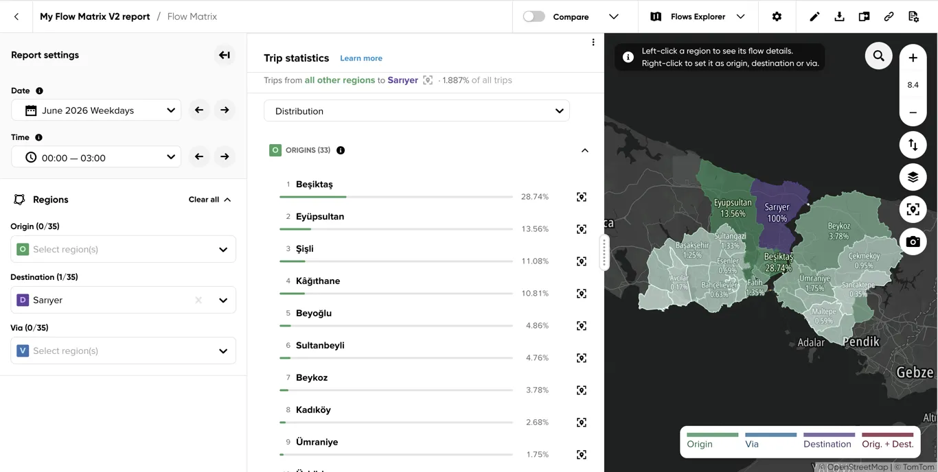
A single Destination, with no origin — trips are ranked by their origin:
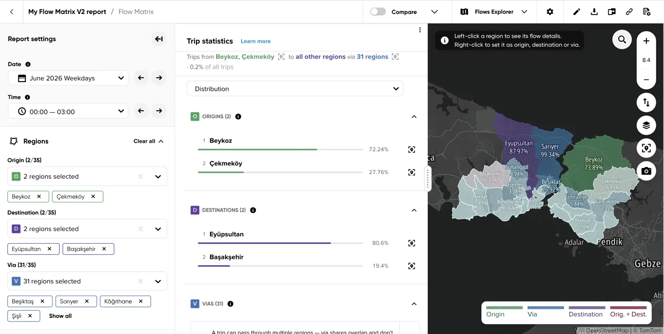
A few regions each as Origin and Destination, with the rest as Via — via alone doesn’t define a flow, so it needs at least one of those to play a role; trips are ranked between the origin and destination sets, filtered to those that pass through one of the via regions:
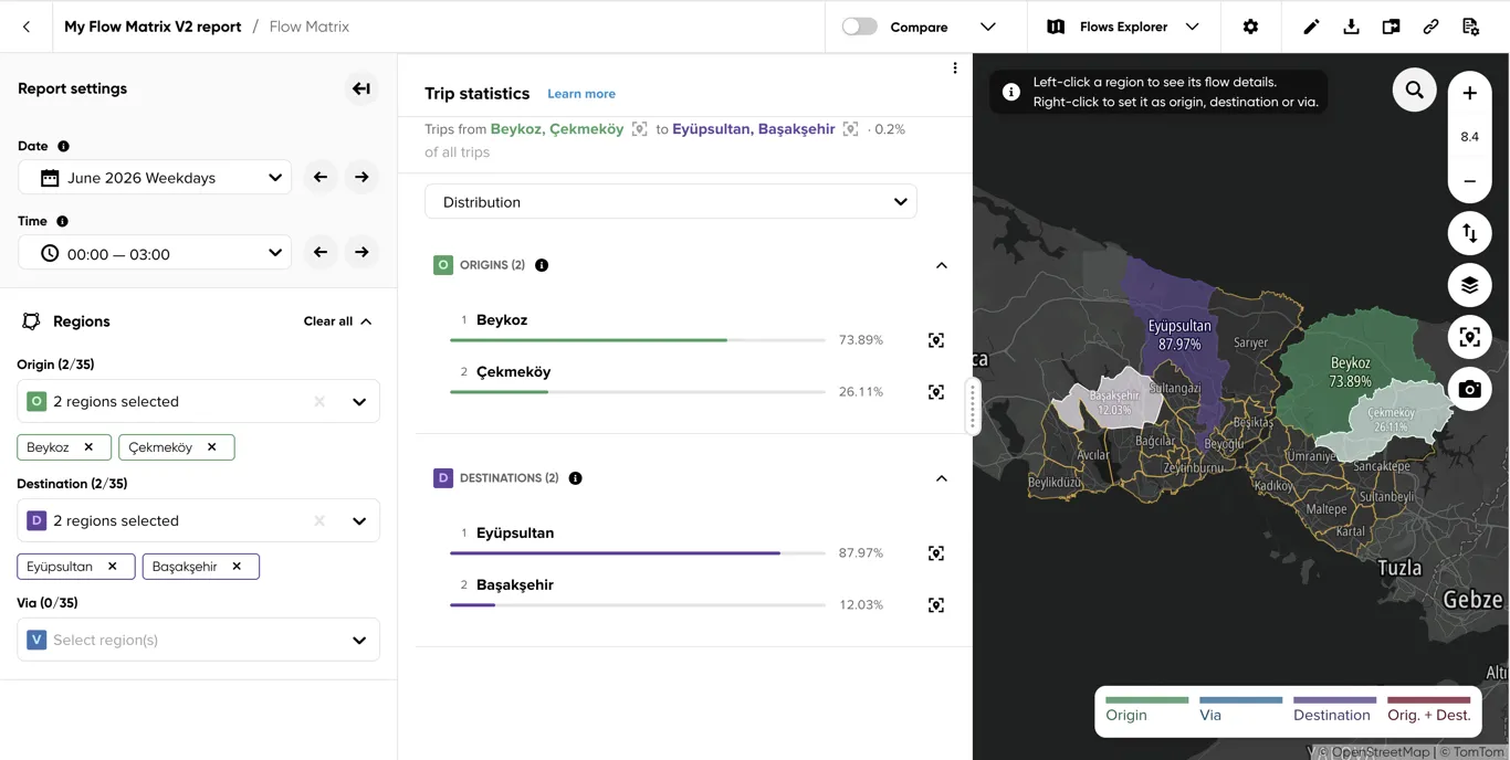
A few regions each as Origin and Destination, with no Via — trips are ranked between the two selected sets:
Results Panel
The results panel describes the trips of the current selection: trips first seen in the selected origin(s) and last seen in the selected destination(s), optionally filtered to those passing through the selected via region(s). The line above the tabs states that scope and its share of all trips in the report.
Once at least one region is selected, tabs above the panel switch between Distribution (which regions the trips connect) and — when the report was created with trip statistics enabled — Trip statistics: four histograms named Start hour, Length, Duration and Average speed (what the trips look like).
Distribution
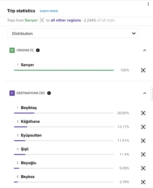
Ranks the regions of the current selection by role — Origins, Destinations and Vias — each with its share of trips. Click the target icon next to a region to zoom the map to it.
How to read the percentages:
- The denominator is always the whole current selection. 8% next to a region means that 8 of every 100 trips in the selection are first seen there (Origins), last seen there (Destinations) or pass through it (Vias). Rows within one list can be compared directly.
- With a single Origin and no destination, the Destinations list ranks where those trips ended and adds up to 100%. With a single Destination and no origin, the Origins list ranks where trips came from and adds up to 100%.
- With several origins and several destinations, each list covers the trips exchanged between the two sets, so both lists share the same total.
- Vias overlap: a trip can pass through several regions and is counted in each of them, so via shares do not add up to 100%. A via share is relative to all origin-to-destination trips of the selection, ignoring the via filter — read it as “x% of trips between these origins and destinations went through this region”.
- A No data row means no trip of the current selection touched that region.
With Flows per km² on (see Layer settings), each region’s trips are divided by its area and the percentage becomes that density’s share of the summed densities of all regions in the list. Use it when regions differ a lot in size and you want to know where traffic is concentrated rather than where it is largest in absolute terms. Each list then adds up to 100% on its own.
Trip statistics
The Start hour, Length, Duration and Average speed tabs are shown only when trip statistics are available for the report. Each of them splits into a Statistics column with summary tiles and a chart column, also labelled Distribution, with the histogram itself. All statistics are estimated from the full histogram at its finest bucket width, independent of the step and percentile settings of the chart, assuming trips are spread evenly inside each bucket — so their precision is about one bucket.
How trip statistics are calculated
- Which trips count — every value on this panel is computed only from trips matching the current selection, for the currently selected date range and time range. Changing the regions, the date or the time recomputes everything.
- What is measured — length and duration cover the part of a trip that lies inside your regions: from the moment the trip enters its origin region until it leaves its destination region. Anything the vehicle did before or after that is not included. Average speed is that length divided by that duration, rounded up to a whole km/h — one value per trip, not an average of speeds along the way. Start hour is the hour, in the report’s timezone, at which the trip entered its origin region; it is the same moment that decides which time range the trip belongs to.
- Buckets — each trip lands in exactly one bucket per histogram: 1 hour for start hour, 1 km for length, 5 min for duration and 1 km/h for average speed. A bucket covers values from its label up to, but not including, the next label (the 10 min duration bucket holds trips of 10 to 14 min). There is no upper cap.
- How to read the percentages — a bucket’s value is its share of all trips in the current selection: a 12% bar at 10 min means that 12 of every 100 trips between the selected regions took 10 to 14 minutes. The whole histogram adds up to 100%, so bars can be compared with each other and read as “how common is this value”. Each date range and time range is its own 100%, so compare shares between ranges as proportions rather than adding them up. With a via region selected, a trip passing through several selected via regions is counted once per via region, so via-filtered shares can exceed the count-once total.
Start hour
Shows when the trips of the selection begin, by the hour at which they entered their origin region. Use it to tell a commuting flow (sharp morning and evening peaks) from a flat, all-day flow.
Statistics: Peak hour (the hour most trips start in, and its share), Busiest 2 h window (the busiest 2 consecutive hours, and their combined share) and Peak vs average hour (how much busier the peak hour is than the average; 1× means trips are spread evenly).
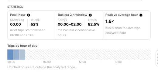
Distribution: a Trips by hour of day bar chart showing the full 24-hour distribution; the bars add up to 100%. Hours outside the analyzed time range are hatched — a hatched hour means “not analyzed”, not “no traffic”, so do not compare it with the analyzed hours.
Length, Duration, Average speed
Each shares the same layout — statistics for trip length (km), duration (min) or average speed (km/h), measured as described in How trip statistics are calculated.
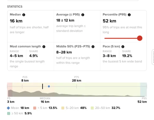
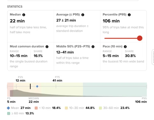
Statistics:
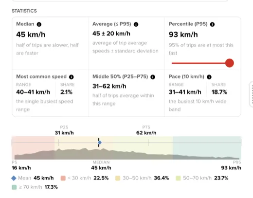
- Median — half of the trips are at most this long (or slow), half are longer. This is the typical trip: unlike the average, it is not pulled up by a few very long or very slow trips, so prefer it whenever the chart has a long tail.
- Average (≤ P95) — the arithmetic mean and its standard deviation, both computed only on trips up to the 95th percentile; the top 5% of trips are excluded so rare extreme trips do not distort the values. A standard deviation close to the mean means the trips are very heterogeneous.
- Percentile (P95 by default) — the value that the given share of trips stays at or below. For duration this is the time to plan for to arrive on time in that share of trips. Use the slider inside the tile (5 to 95, in steps of 5) to change the percentile; for speed, P85 is the standard traffic engineering reference speed.
- Most common range — the single fullest bucket, at the report’s native width, and its share of all trips. Two distant peaks in the chart usually mean the flow mixes free-flow and congested conditions.
- Middle 50% (P25–P75) — the range holding the middle half of the trips, with the lowest and highest quarter left out. A narrow range means predictable trips; a wide one means the same trip takes very different values on different days.
- Pace — the fixed-width band holding the most trips and its share: 10 min for duration, 5 km for length and 10 km/h for average speed (the traffic engineering “pace”). A high share means most trips behave alike.
Below the tiles, a range bar places these on one axis running from the 5th to the 95th percentile: the box is the Middle 50%, the thick line the Median and the diamond the trimmed Average. The grey silhouette behind them is the shape of the distribution, and the shaded bands give the share of all trips below and above fixed thresholds (30, 50 and 70 km/h for speed; 10, 30 and 60 min for duration; 5, 20 and 50 km for length). Hover a marker to read its value and the share of trips below it.
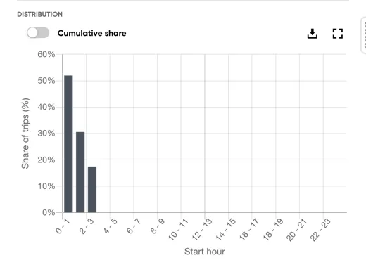
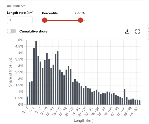
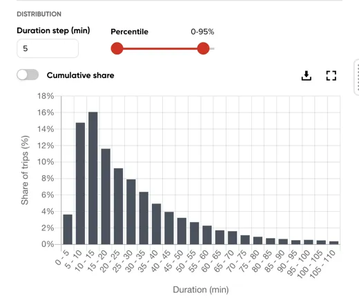
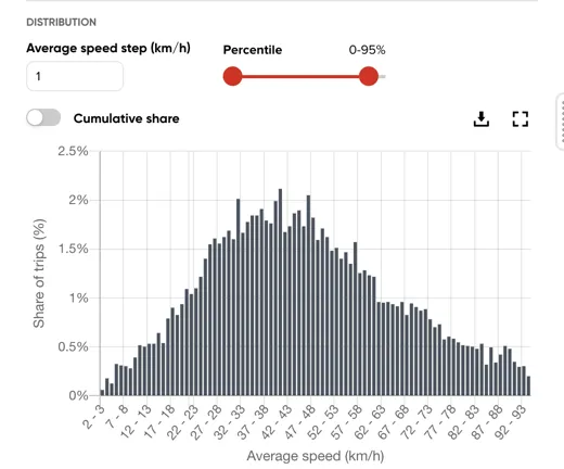
Distribution: a bar chart of the share of trips per bucket; the bars add up to 100% over the whole histogram. Two controls change what the chart shows, without affecting the statistics:
- Length step, Duration step or Average speed step — merges buckets into wider ones for a smoother chart. The default is the report’s native width (1 km, 5 min, 1 km/h); only multiples of it are accepted.
- Percentile — a range, 0–95% by default, that clips the horizontal axis to the trips between those percentiles, hiding the long tail. The bars keep their share of all trips, so cutting off the top 5% removes 5% of the total from view rather than rescaling the rest.
Map Area
Common controls and legend behavior are described in Viewing analysis results.
Helper text and region coloring
A helper message in the top-left corner explains how to select regions before any are picked, and the map colors every other region by its share of trips relative to the current selection.
Results layer
The map highlights selected regions by role (Origin, Via, Destination, or Same O/D). Selecting 2 or more regions with Shift + drag shows a Selected N region(s) menu near the bottom-right corner, letting you assign all of them to a role at once.