
Matrix
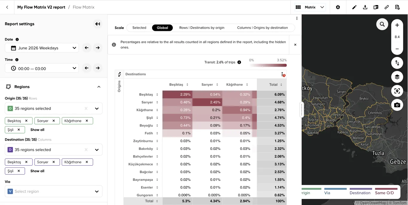
The Matrix visualization shows the connections between your defined regions as a table, with each cell colored by trip share. Use it to see at a glance which region pairs exchange the most traffic, how much of each region’s traffic stays inside it, and how the picture changes between date and time ranges.
See Viewing analysis results for common top bar actions, Date and Time controls, results panel placement, map controls, and legends.
Top Bar - Info & Actions
Common report actions are described in Viewing analysis results. Matrix adds the following visualization-specific actions.
Visualization type
Switches between Overview, Matrix and Flows Explorer — see Overview’s Visualization type.
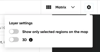
Layer settings
Opens a popover with two map-layer toggles:
- Show only selected regions on the map — hides every region not currently shown as a row or column in the table.
- 3D — extrudes each region’s surface in proportion to its value; right-click-drag the map to tilt the view and see the extrusion. Disabled until a region is selected.
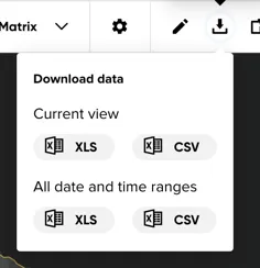
Download results
Downloads the matrix data as CSV or Excel, either for the Current view (the regions and via filter currently shown) or All date and time ranges.
Left Panel - Report Settings
Date and Time
See Date and Time for the common selector mechanics, assignment rules, and information tooltips.
Regions
Use the Origin and Destination selectors to choose which regions appear as table rows and columns. Add a Via region to filter the matrix to trips that passed through it.
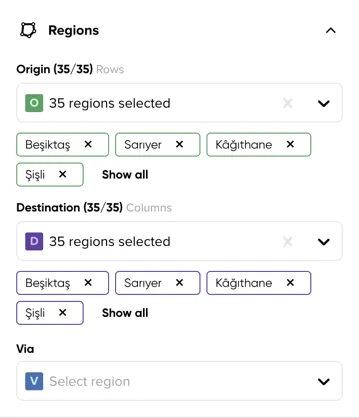
If fewer regions are selected as rows or columns than exist in the report, a Some regions are hidden warning appears below the selectors.
Results Panel
How the matrix is calculated
- What a cell means — the cell in row A and column B holds the trips first seen in region A and last seen in region B. “First seen” and “last seen” are where the trip starts or ends if that happens inside your regions, or where it enters and leaves the analysis area if not. A trip therefore always belongs to exactly one origin-destination cell, even if it passed through other regions on the way.
- Same O/D cells — the diagonal (A to A) holds trips first and last seen in the same region: trips fully inside that region, but also trips that entered and left the analysis area through it, possibly crossing other regions in between.
- How to read the percentages — a cell’s value is a share of trips, and what it is a share of depends on the Scale option described under Table: all trips between the regions shown (Selected), all trips in the report (Global), the trips of its row (Rows) or the trips of its column (Columns). For example, with Global selected, 8% means that 8 of every 100 trips analyzed for the current date range and time range went from that origin to that destination; with Rows selected, the same cell shows what share of trips from that origin ended in that destination. Whatever the scale, each date range and time range is its own 100%, so compare shares between ranges as proportions rather than adding them up.
- Via — with a via region selected, every cell shows only the trips between that origin and destination that also passed through the via region. This is a drill-down of the same trips, not a new total: under the Global scale the filtered matrix adds up to less than 100% (the rest of the traffic did not pass through the via region), while the other scales re-normalize to the via-filtered trips. A trip that crossed several regions appears in each of their via views.
Table
Rows are origins and columns are destinations by default. Hidden regions (those not selected as rows or columns) stay out of the table, but the Global scale still counts them.
-
Scale — only shown when values are displayed as percentages, not trip counts. It changes the denominator, so the same cell reads differently under each option:
- Selected (default) — the share of all trips between the regions currently shown in the matrix. The visible table adds up to 100%. Use it to compare region pairs with each other.
- Global — the share of all trips in the report, including hidden regions. Nothing in the table adds up to 100% unless every region is shown; the difference to 100% is the traffic of the hidden regions. Use it to keep values comparable while hiding and showing regions.
- Rows | Destinations by origin — each row is scaled on its own: cells show the share of trips starting in the row’s region that ended in each destination, filtered by selected regions. Each row adds up to 100%. Answers “where do trips from A go?”.
- Columns | Origins by destination — each column is scaled on its own: cells show the share of trips ending in the column’s region that came from each origin, filtered by selected regions. Each column adds up to 100%. Answers “where do trips to B come from?”.
An info banner beneath the selector explains the option currently selected, and can be dismissed. Under all four options a value is a share of trips, and it always covers the selected via region when one is set.
-
Swap origins and destinations — the swap button in the table’s top-left corner transposes the table, so rows become destinations and columns origins; the region filters and the row and column scale options follow the swap.
-
Click a row or column header’s sort arrows to reorder the other axis by that region’s values; the arrows on the Total headers sort by totals.
-
The Total row and column add up the cells shown in that row or column, including the same O/D cell; hidden regions do not contribute. Under the Rows scale every row total is 100% so only the Total column is shown, and under Columns only the Total row.
-
Click a cell to display additional information about its trips: how many of them really started and ended inside the defined regions, entered from outside, left to outside or only passed through. See Show insights on cell hover under Table options for how to read them.
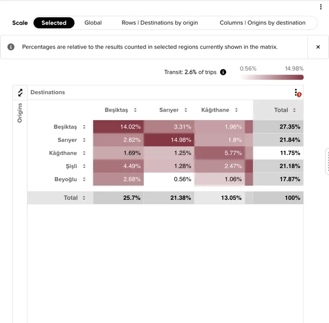
Table options
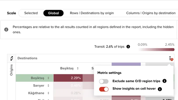
Opens a popover with additional table toggles:
-
Exclude same O/D region trips — excludes trips that were seen for the first and last time in the same region, including those which crossed other via regions. The diagonal drops to zero and every percentage is recomputed without those trips, so the remaining cells grow. Use it when internal traffic dominates the matrix and hides the exchanges between regions.
-
Show insights on cell hover — hovering a cell shows how its trips relate to the analysis area, as shares of that cell’s own trips:
- Started and ended in region — trips whose real start and end both lie inside the defined regions.
- Entered from outside — trips that really started outside the defined regions and entered through the origin region.
- Left to outside — trips that really ended outside the defined regions and left through the destination region.
- Transit (both ends outside) — trips that only passed through, entering through the origin and leaving through the destination region.
When one group holds at least 60% of the cell’s trips, a one-line summary names it, for example “Mostly inbound trips entering the defined regions through A” or, on a same O/D cell, “A is mainly a transit region”. These shares do not depend on the Scale option. Use them to tell genuine traffic between two regions from traffic that merely crosses the analysis area, especially for regions on its edge.
Map Area
Common controls and legend behavior are described in Viewing analysis results.
Helper text and region coloring
A helper message in the top-left corner explains what’s currently shown, and a warning appears if regions are hidden by the Show only selected regions on the map layer setting.
Hovering a column header highlights the share of trips to that destination from each origin, and hovering a row header highlights the share of trips from that origin to each destination — as shown by default; clicking the swap icon in the table’s top-left corner reverses this, putting origins in columns and destinations in rows.
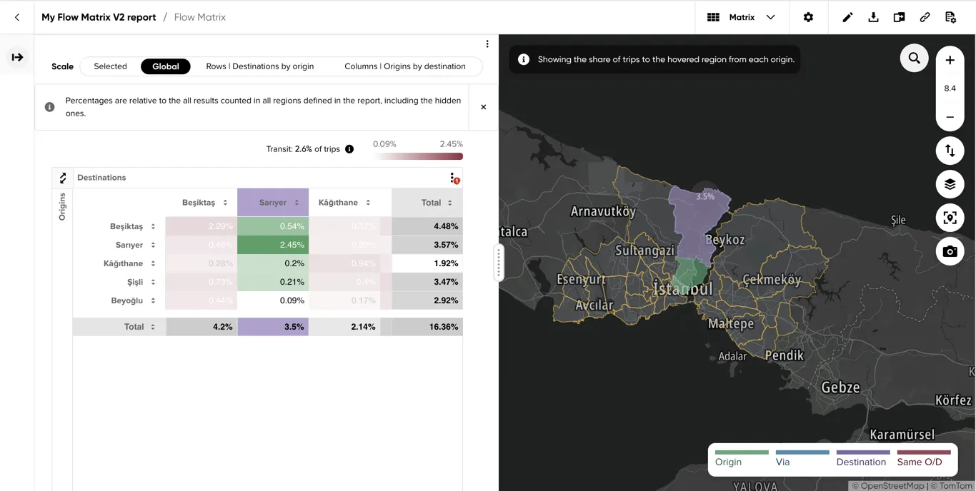
Hovering a row header highlights the share of trips from that origin to each destination:
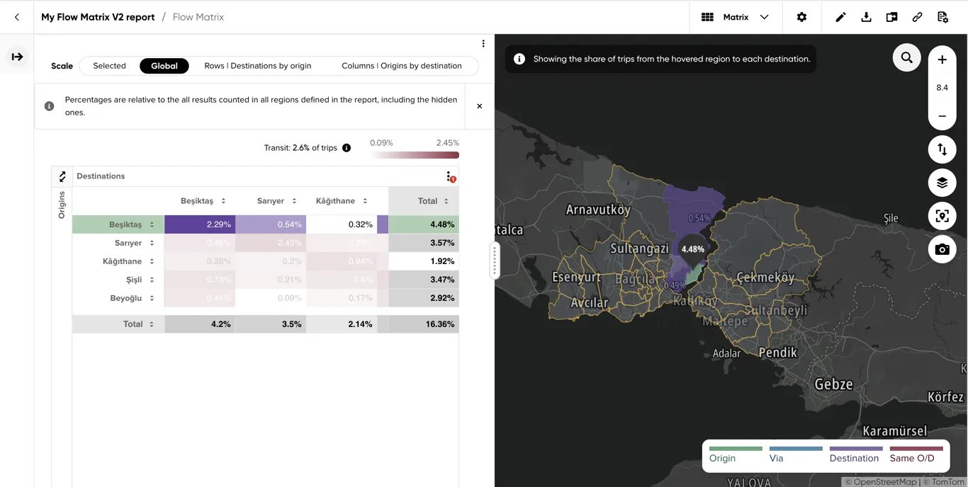
Hovering a cell highlights its origin and destination regions and draws an animated flow line between them — or, with a via region selected, the regions trips between that origin and destination pass through:
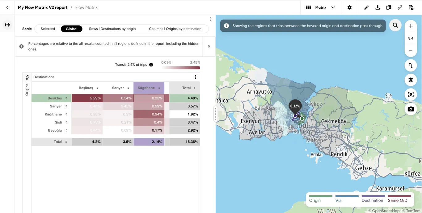
Results layer
The map highlights the regions currently shown in the table, colored by role (Origin, Via, Destination, or Same O/D) — this coloring, and the flow lines described above, only appear while hovering a row, column or cell in the table. Region names can be toggled on the map from the layers menu in the bottom-right corner.